Branding Vancouver looks at some of the more interesting logos and icons that appear in Vancouver’s food and beverage scene. Some of the explanations will be long and others short, but the goal of deeper understanding will be constant. If you want the backstory of a particularly compelling local brand revealed, let us know via @scoutmagazine and we’ll try to figure it out.
The Brand: This week we are exploring the ominous story behind the contrasting elements of modern Asian eatery, Torafuku. The sleek Main Street space was designed by Scott & Scott Architects with the branding work done by Brief interdisciplinary design studio. Here’s the story, as told by the restaurant’s omnipresent co-owner and GM, Steve Kuan:
The name Torafuku simply translates to “Lucky Tiger”. Everything seems linked together when the name comes up. First, we started off with the food truck called “Le Tigre” (“The Tiger”, in French), where we based all of our cooking from our French culinary backgrounds combined with our modern Asian takes. Second, our restaurant address, 958 Main, coincidentally has an Asian lucky number (kinda represents prosperity and fortune).
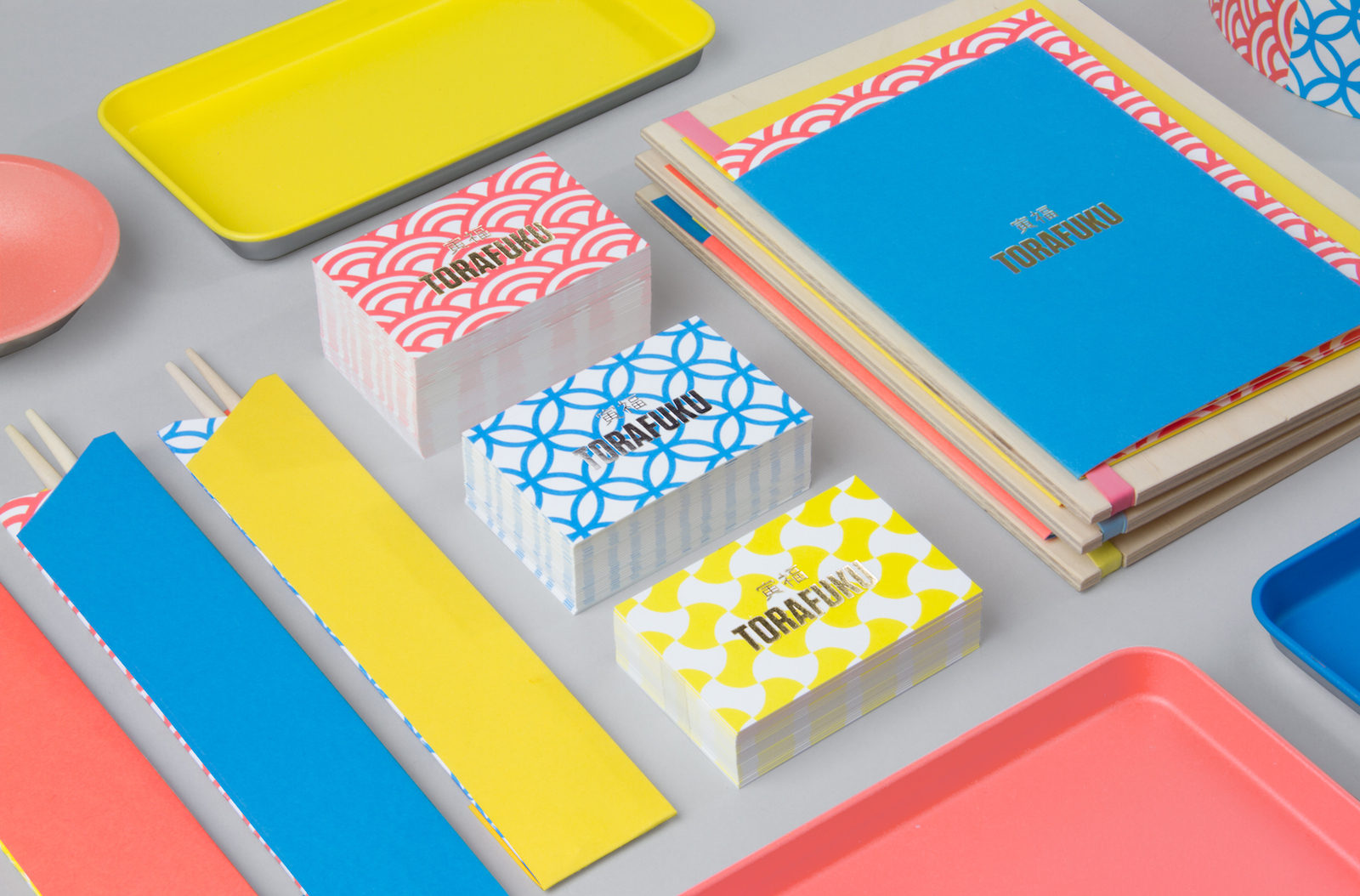
We carefully worked with both Brief, our branding designer, and our architect interior designer. Since the concept of the restaurant is minimalist, simple and modern industrial, the restaurant itself has a lot of concrete elements which can be a bit cool and stiff by itself. Therefore, we chose to have a very strong contrast of colour in our menu, our water bottles and even the bill trays. They all have Asian patterns, vibrant colours (i.e. bright yellow, orange and blue), and are welcoming and inviting. We also added some gold and silver elements, representing Asian cultures.
We were very fortunate and lucky to work with our designers. We had countless meetings where they slowly got to know all of us, what we like and what we don’t like. We went through many revisions from the patterns, colours and the fonts. I would say nothing is ever perfect, but we were very happy and pleased with the outcome.

Thomas Albrighton of Brief extrapolates on the creative process…
With the fun character of the ‘Le Tigre food truck team’ and the modern utilitarian designed interior of Scott & Scott Architects our challenge for the branding of Torafuku was to bridge these two things together. We came into the project with the interior design being pretty established. Scott & Scott were working on a modern, raw approach for the restaurant space, choosing utilitarian materials intended to change with age and use (ie. concrete and leather). Most of the colour in the space spoke of the actual materials themselves.
In terms of branding we started with the ‘Le Tigre team’ with just a theme and no real name. They wanted to reference ‘Le Tigre’ but make it clear that the menu at ‘Torafuku’ was a completely different experience. So, working with them closely with a selection of different names, we came up with the name ‘Torafuku’ meaning ‘Lucky Tiger’ in Japanese. Initial concepts for the brand were literal interpretations of this name (symbols of tigers, etc.) but were quickly thrown out as they were too obvious. Our focus shifted towards the craft, detail and presentation that went into each dish at the restaurant…
Like Scott & Scott we represented this craft and attention to detail through the use of carefully selected materials. Instead of concrete, leather, denim and steel we chose beautiful coloured paper stocks, gold and silver foils and offset printed colour blocked card stock. We too were okay about the materials showing wear and tear over time.
Our solution to bridging everything together was basically to do the exact opposite and use ‘contrast’ to emphasize the identity. For the brand to really pop in the same way that the restaurant was run, we had to bring in colours that popped! We represented these colours using a mix of solids and modern interpretations of traditional Asian patterns. As the face of the brand we designed the word mark for Torafuku in a bold condensed font, again aiming to keep things simple. The logo could either be represented in silver or gold and ideally in foil. This really is a quick summarized version of our process. Looking at the end results of the project, ‘restraint’ played a major role in our process in maintaining the simplicity of the final design.
– Branding Images courtesy of Brief –


Main Street

¿CóMO? Taperia and Paella Guys Popular Paella Series Returns in May

Getting to Know Best-Friends-in-Business, Winnie Sun and Hassib Sarwari

Enjoy an Evening of Exceptional Japanese Sake at Burdock & Co, April 8th

Announcing the Ultimate Cross-Continent Dining Experience, April 28th at Published on Main

Published on Main is Hiring a General Manager

Hero’s Welcome Celebrates Two Years
Popular

Vancouver's Most Racist Restaurant, Remembered
¿CóMO? Taperia and Paella Guys Popular Paella Series Returns in May

Ten Places to Steam, Soak and Sauna In and Around Vancouver, Mapped

The Coolest New Bars to Score a Cocktail in Vancouver Right Now

The Newest, Coolest and Best Food & Drink in Victoria Right Now


